Monday, October 15, 2012

Reinhart-Rogoff Effect

Carmen Reinhart has quickly become the top economist for understanding financial crises. Carmen is the most cited female economist. Lately she has focused her attention on the recovery following a financial crisis and economic growth in a period of debt (paper 1 and 2).

Today, she finds herself thrown into the political debate for her views on an economic recovery following a major financial disruption.
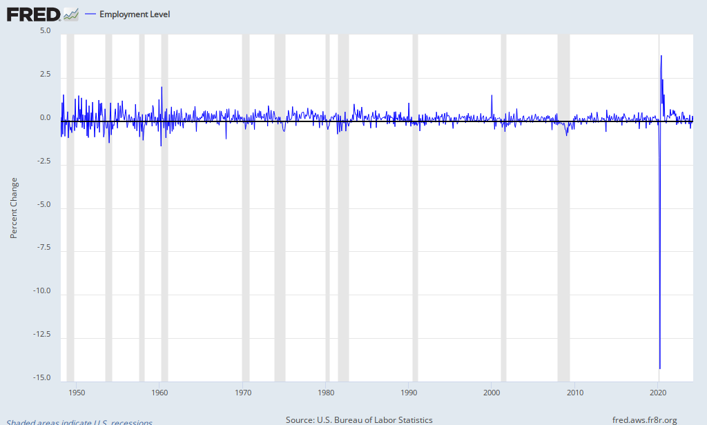
Rutgers University economic historian Michael Bordo and Cleveland Fed economist Joseph Haubrich studied just U.S. recessions going back to 1882 and found that U.S. recoveries following financial shocks tend to be rapid. Top economic advisers to Republican Mitt Romney have leaned on this research to argue that the culprit in the current slow recovery is Mr. Obama himself, not the financial crisis that preceded him. This line of research has taken issue with the Reinhart and Rogoff studies, arguing, among other things, that U.S. crises can’t be likened to financial crises that have happened elsewhere in the world — such as small developing markets – because their economic institutions are so different.
When Barack Obama first took office he promised a quick recovery. We had just went through the largest financial disruption in over eighty years. Quick was not going to happen. Reinhart and Rogoff said so. In December of 2008 they posted, "The Aftermath of Financial Crises," in which they showed for major financial crises unemployment will remain above 7% for nearly five years. Why did Obama think this time would be different. It wouldn't be. Have we not learned anything?
Now Reinhart and Rogoff are firing back. In a short paper they released this weekend, they fire back at the Bordo work. They see several flaws. One of their main arguments is that the Bordo work includes borderline financial shocks which weren’t full blown crises. Reinhart and Rogoff argue that if the paper focused on the four full blown U.S. crises of the past 150 years – in 1873, 1893, 1907 and the 1930s – they would get results similar to the broad swath of international crises the Harvard professors examined.
Four years ago, I was using Reinhart and Rogoff's view to criticize Obama's policy views. He made a mistake by telling the American people the recovery would be swift. Unfortunately, he was wrong. Should we be surprised? No, it did not matter what the president did in office or who we elected. After a financial crisis it takes a tremendous amount of time for capital markets to liquidate bad assets, home and stock prices to stabilize, and government debt to come under control.

Here we are, five years after the collapse of the housing market. What have we learned? Reinhart and Rogoff were correct once again.
Secondly, we assess how has the US has fared, so far, compared to other advanced economies countries that experienced systemic financial crises in 2007-2008 as well other advanced economies that experienced borderline episodes. Focusing on real per capita GDP, we show (i) the recent crises patterns confirm our earlier result that the countries that recently suffered systemic financial crises have generally fared quite poorly compared to countries where the financial problem was less severe, that is, borderline, and (ii) although tracking worse than the countries that did not have systemic financial crises, the United States output performance is, in fact, among the best of those that did.
For more information, Rogoff did an interview here.

Ezra Klein has a nice write up here.

Friday, October 5, 2012

Comparing Household Survey with Payroll Numbers

A quick addition to the last post. One of the concerns was the large difference between the payroll numbers (114,000) and household survey numbers (873,000) (for a detailed definition check here). I am simply going to point out that the difference is not that big comparing to previous periods. Here is a graph showing the difference in the month-to-month change in the employment data where I have taken the difference between the household survey data and the payroll data.


As expected, the graph still shows a lot of noise and in absolute terms 2012 does not appear to be an anomaly. 

Month Difference in Housing Survey and Payroll
2000-01-01 1788.00000
1960-04-01 932.00000
1948-04-01 931.00000
1990-01-01 913.00000
2003-01-01 896.00000
2002-02-01 883.00000
2001-09-01 848.00000
2012-09-01 759.00000
1954-02-01 725.00000
1983-08-01 708.00000
1991-04-01 669.00000
1953-01-01 665.00000
1960-11-01 659.00000
1948-06-01 652.00000
2002-09-01 652.00000
1970-10-01 617.00000
1983-06-01 613.00000
1956-07-01 609.00000

BLS Numbers

All of the talk today has been over the recent unemployment numbers. The unemployment rate fell from 8.1% to 7.8% and employment increased by 873,000. With these numbers came the conspiracies (google Jack Welch). Without going into a lot of details about the conspiracies, I'm going to post two graphs that will hopefully end this debate. Here is the first graph that simply compares month-to-month change in employment reported by the household survey. 


First thing one is likely to notice is the considerable noise in the data. The next thing you will likely notice is the spike that occurred in January of 2000. During this month the economy added 2 million jobs. In fact you will likely notice that April of 1960 and January of 1990 also included large spikes in employment. In 2012 there were two employment spikes, the first in February (went largely unnoticed) and then in September. The economy added 847,000 and 873,000 jobs, respectively. These number also compared to those posted in 1983. In June of 1983 the economy added 991,000 jobs and the May of 1984 added another 857,000. Both 2012 and 1983-4 are very similar in that they follow large periods of declines in the employment numbers. 

Here is a table showing the months with the most change in employment levels:

Month Change in Employment
2000-01-01 2036
1960-04-01 1286
1990-01-01 1251
1983-06-01 991
2003-01-01 991
1948-06-01 889
2012-09-01 873
1984-05-01 857
1950-04-01 855
2012-01-01 847
1959-12-01 811
1950-08-01 796
1973-02-01 751

In the second graph, we are simply looking at the percent change in the employment numbers relative to the previous month. Here we see that the two months in 2012 saw employment increase by a little more than 0.6%. Relative to history, there are 48 months in the last 65 years that had a faster growth in the employment numbers. Compared to 1983 these numbers are considerably lower. In 1983-4 the two months added employment at rates of 0.82% and 1%. Conspiracy? Doubtful.


Month % Change in Employment
1960-04-01 1.988465047
1948-06-01 1.536626681
2000-01-01 1.513495833
1950-04-01 1.481083703
1950-08-01 1.349129676
1949-11-01 1.292147584
1959-12-01 1.256779792
1951-03-01 1.240341261
1952-09-01 1.222612477
1955-07-01 1.184830288
1951-12-01 1.104686142
1948-04-01 1.075063724
1954-02-01 1.06457417
1990-01-01 1.061699058
1953-01-01 1.059815599
1955-01-01 1.059618072
1952-11-01 1.024412958
1983-06-01 0.994560527
1957-02-01 0.982210209
1959-03-01 0.915457572
1955-04-01 0.903812086
1973-02-01 0.903067544
1951-07-01 0.899027172
1964-04-01 0.862382386
1976-01-01 0.848093233
1961-06-01 0.831181531
1984-05-01 0.821384757
1959-04-01 0.779560272
1977-11-01 0.761939561
1962-08-01 0.729509799
1960-11-01 0.72677962
2003-01-01 0.726401126
1968-05-01 0.722594989
1954-09-01 0.716756052
1953-06-01 0.716170373
1968-02-01 0.708165997
1971-07-01 0.695811166
1950-06-01 0.687138741
1969-02-01 0.679643252
1983-11-01 0.676212037
1955-12-01 0.675024108
1978-04-01 0.674370746
1962-02-01 0.650450778
1973-03-01 0.643531319
1973-06-01 0.634391834
1975-07-01 0.631480288
1964-02-01 0.620545319
1986-01-01 0.620056184
2012-09-01 0.614351764
1965-07-01 0.612460401
1972-01-01 0.606429645
1969-06-01 0.604557433
1984-02-01 0.603676321
1967-04-01 0.603221721
2012-01-01 0.601605228